Cart
0
Add $150.00 more for free shipping!


A handbag brand becomes memorable when it repeats the same small set of design choices across every collection until customers can identify the bag without seeing a logo. Our audit of 12 leading handbag houses found that all of them keep a consistent design language and a rooted brand story, while roughly three out of four rely on a repeated silhouette as their strongest identifier. Independent brands can apply the same formula at a smaller scale.
Most articles on brand identity offer general advice. We wanted numbers instead, so we built a small original audit. We reviewed 12 handbag houses with strong public recognition, Hermès, Chanel, Louis Vuitton, Fendi, Bottega Veneta, Dior, Prada, Gucci, Saint Laurent, Celine, Mansur Gavriel, and Polène, and scored each one across the seven design elements this article covers.
| Brand | Signature Silhouette | Recognizable Hardware | Material Or Technique | Design Language | Story Anchor | Signature Color | Standout Detail |
|---|---|---|---|---|---|---|---|
| Hermès | Yes, the Birkin and Kelly flap shape | Yes, the turn lock closure | Yes, the visible saddle stitch | Yes | Yes, an equestrian harness house | No fixed bag color | Yes, a single hand guided seam |
| Chanel | Yes, the quilted flap | Yes, the interlocking CC turn lock | Yes, diamond quilting | Yes | Yes, Coco Chanel, 1955 | No fixed bag color | Yes, the chain and leather strap |
| Louis Vuitton | Yes, the Speedy cylinder | No, hardware plays a supporting role | Yes, monogram canvas | Yes | Yes, a trunk making origin | Yes, tan and brown monogram | Yes, the repeated LV motif |
| Fendi | Yes, the Baguette shape | Yes, the FF clasp | No, materials rotate seasonally | Yes | Yes, a Rome ready made couture house | No fixed bag color | Yes, the short top handle with no strap |
| Bottega Veneta | No, shapes vary by season | No, hardware is intentionally minimal | Yes, the Intrecciato weave | Yes | Yes, craft over branding | Yes, a signature green became associated with the house | Yes, the woven texture functions as the logo |
| Dior | Yes, the saddle curve | Yes, the CD clasp | Yes, cannage stitching | Yes | Yes, the Christian Dior couture house | No fixed bag color | Yes, the D charm and saddle flap |
| Prada | No, shapes rotate | No, hardware plays a supporting role | Yes, the Re Nylon fabric | Yes | Yes, Milan sports luggage roots | Yes, black nylon | Yes, the inverted triangle plate |
| Gucci | No, shapes rotate | Yes, the horsebit | Yes, GG canvas | Yes | Yes, an equestrian founding story | Yes, the green and red web stripe | Yes, the bamboo handle on select styles |
| Saint Laurent | Yes, the quilted Loulou shape | Yes, the Cassandre logo plaque | Yes, chevron quilting | Yes | Yes, the Cassandre logo since 1961 | No fixed bag color | Yes, the curb chain strap |
| Celine | Yes, the Luggage trapeze wings | No, hardware plays a supporting role | No, materials rotate | Yes | Yes, understated Parisian minimalism | No fixed bag color | Yes, the winged side panels |
| Mansur Gavriel | Yes, the bucket cylinder | No, hardware plays a supporting role | No, materials rotate | Yes | Yes, a minimalist New York origin | Yes, a bright interior against a neutral exterior | Yes, the color pop lining |
| Polène | Yes, the curved Numéro Un trapeze | No, an understated clasp | No, materials rotate | Yes | Yes, a Paris family atelier | No fixed bag color | Yes, the sculptural curved seam |
What the audit shows:
The pattern that jumps out is this. A fixed color palette is the least common driver of recognition, while a consistent design language and an anchored story are universal. Brands often assume they need a logo or a loud color to be memorable, when the audit suggests the opposite. Restraint and repetition do more work than decoration.
A silhouette is the shape a bag makes in silhouette, literally, when you cannot see the logo, the color, or the leather grain. The Hermès Birkin, the Chanel flap, the Celine Luggage tote, and the Mansur Gavriel bucket are all identifiable from a shadow. In our audit, 75 percent of brands rely on a shape that has barely changed in decades.
The lesson for any brand, established or new, is to stop redesigning the base shape every season. Novelty belongs in color and material. The silhouette should be the one constant a customer can count on.
Hardware is the fastest way to authenticate a bag at a glance, the Hermès turn lock, the Chanel CC, the Dior CD clasp, the Gucci horsebit. Half of the brands in our audit built at least part of their identity around a specific hardware shape, and none of them use more than one or two signature pieces. A brand that changes its clasp, zipper pull, or lock every season is trading recognition for novelty.
Two thirds of the brands we studied are known first for a material or a technique rather than a logo, Bottega Veneta's woven Intrecciato leather, Louis Vuitton's coated monogram canvas, Prada's nylon, Chanel's quilting. Craftsmanship becomes branding when it is visible and repeated, a woven texture, a stitch pattern, a grain of leather that shows up on every bag the house makes.
This is the most accessible design element for a smaller or newer brand. A distinctive leather finish or a repeated stitch pattern costs far less to build than a global hardware supply chain, and it reads as intentional the moment a customer sees two bags side by side.
Design language is the invisible rule set behind every decision, proportions, corner shapes, strap width, the way a flap closes. It is the one element every single brand in our audit shared. A design language does not need to be complicated. It needs to be applied without exception, on every silhouette, every season, every price point in the line.
This is where many young labels lose their identity. A brand might launch with a strong first bag, then let the next three drift toward whatever is trending that year. The houses that stay recognizable treat their early design rules as fixed, not as a starting draft.
Every brand in our audit has an origin story it repeats consistently, an equestrian house, a family atelier, a couture founder, a city of origin. Story does two things a shape or a color cannot. It gives customers a reason to care before they touch the leather, and it gives every future collection a frame to be judged against.
Heritage houses also tend to name their icons after real people, Kelly, Birkin, Lady Dior. A name turns a product into a character with a history, which is far stickier in memory than a style number.
Color is the least common driver of recognition in our audit, present for only 42 percent of the brands studied, and it usually shows up as a supporting signal rather than the main identifier, Gucci's web stripe, Louis Vuitton's tan monogram, Mansur Gavriel's interior color pop. Most heritage houses let the leather's natural tones, black, cognac, tan, do the talking and save bright color for limited pieces.
The takeaway for a growing brand is not to skip color entirely, but to treat it as a supporting signature rather than the whole identity. A small, repeated palette used the same way every season builds more recognition than a wide, ever changing one.
Every brand in the audit had at least one small physical detail customers could describe without looking, a stitch, a charm, a handle shape, a lining color. These details work because they reward attention. A customer who owns the bag notices them daily, and a customer who does not own it recognizes them from across a room. The detail is often the cheapest element to build and the last one a competitor can copy convincingly, because it only means something once it has a history attached to it.
Heritage houses had a hundred years to build recognition. A newer, independent label does not have that runway, but the same seven elements work at a smaller scale, and they are often more achievable for a young brand than people assume.
Onna Ehrlich is a useful case study because the brand applies several of these principles already, without the scale of a heritage house behind it.
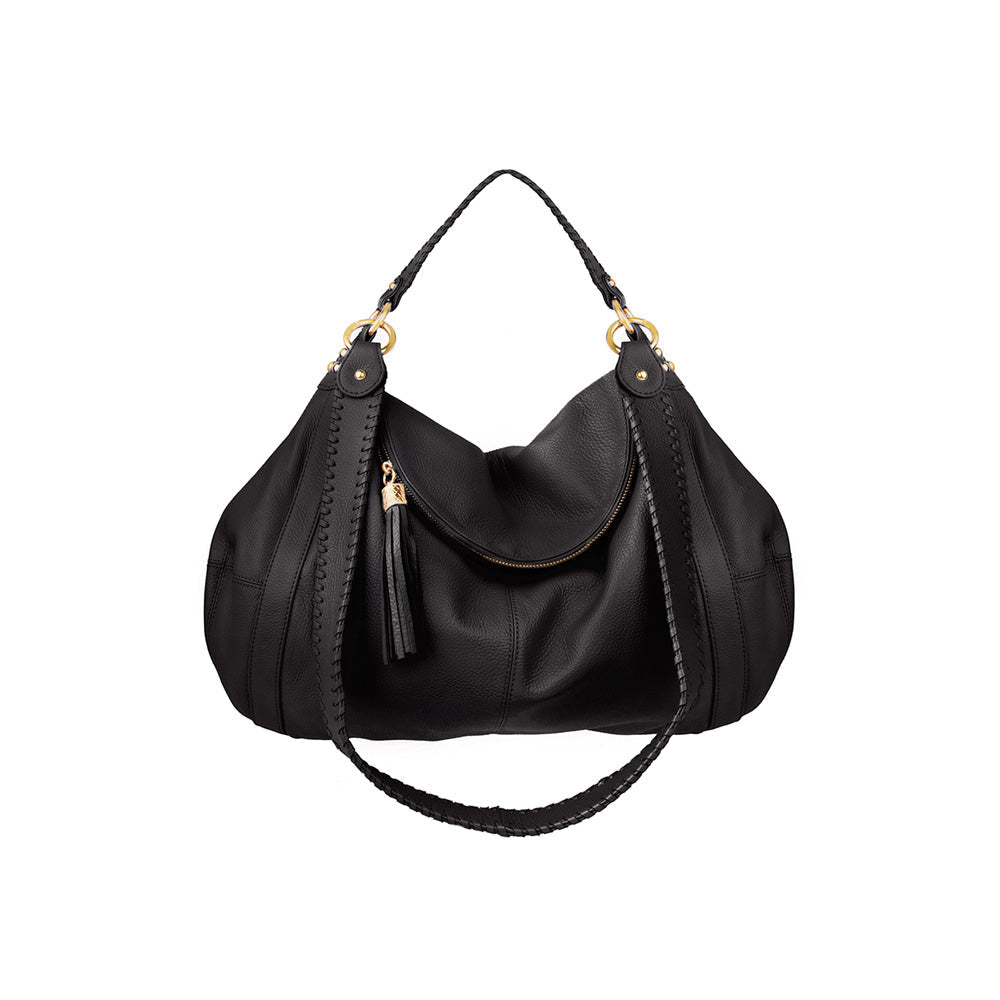
Named silhouettes, not style numbers. Rachel, Lelu, Amelia, Miko, and Penny are named the way Kelly and Birkin are named, giving each shape a character rather than a code. Rachel is a soft shoulder bag with a hobo shaped body, Lelu is a slim pebbled leather crossbody, Amelia is a structured tote in pin hole stamped cowhide, Miko is a minimalist carry on tote, and Penny is a structured shoulder bag in pebbled cowhide. Each name carries its shape forward season after season instead of resetting.
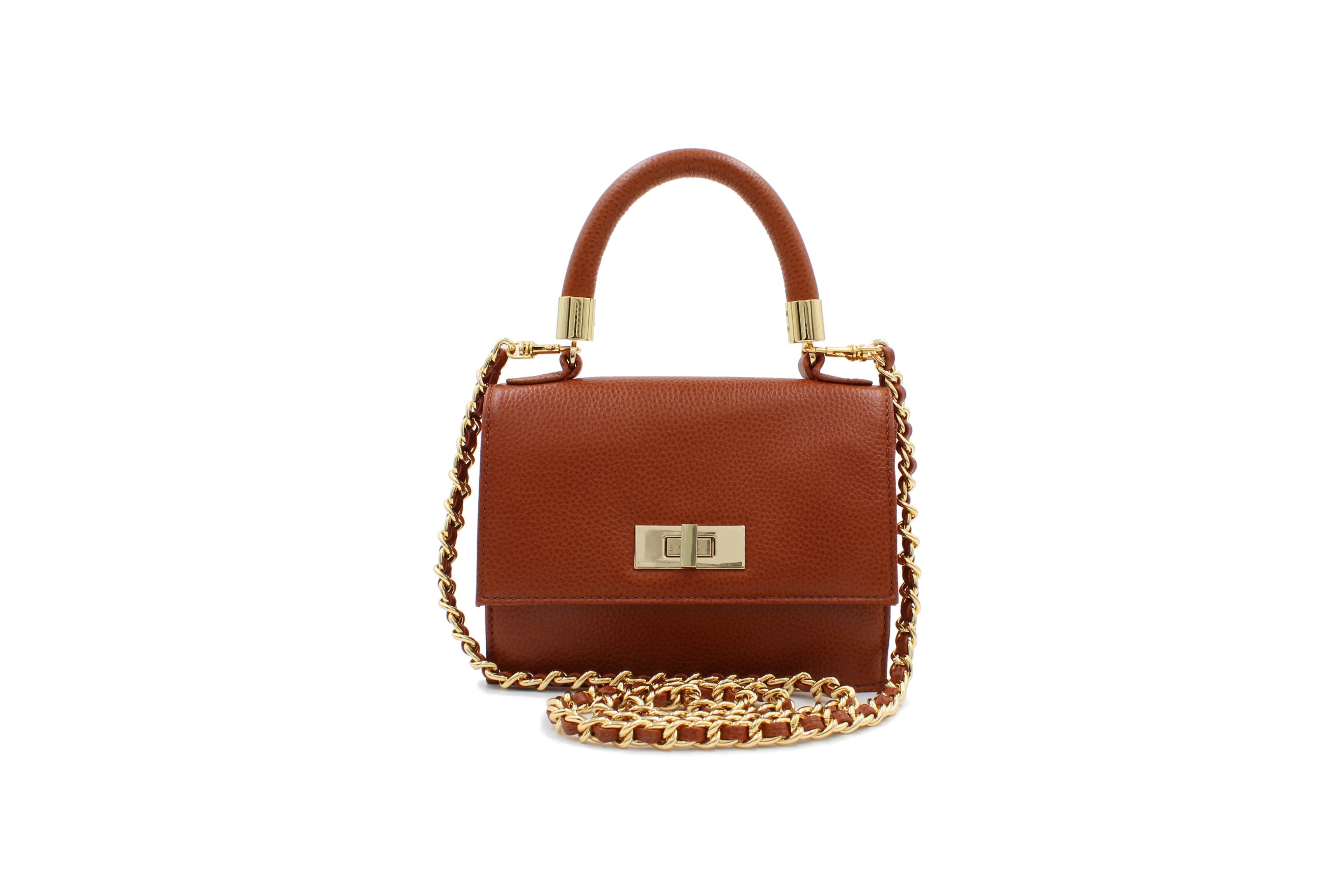
A repeated material signature. Pebbled leather and pin hole stamped cowhide show up across the Lelu, Mini Cloey, Penny, and Amelia lines rather than being a one season finish. This mirrors the audit finding that two thirds of recognizable brands lead with material rather than logo.
A tight, repeated color story. Cognac, black, bone, and shitake appear across nearly every silhouette in the collection, giving the range a family resemblance even as individual bags change. This is the same restraint the audit found in 58 percent of the fixed color brands, a small palette used consistently rather than a wide one used loosely.
A story tied to place. Onna Ehrlich anchors its identity to Los Angeles design, the same way the audited houses anchor to Paris, Milan, or an equestrian tradition. A location or a founding detail gives customers something to repeat when they describe the brand to someone else.
The opportunity for any independent handbag label is to pick one silhouette, one hardware detail, and one material finish, then refuse to change them for several seasons even when trend cycles push toward novelty. Recognition is built through repetition, not through variety.
What makes a handbag brand memorable?
A handbag brand becomes memorable by repeating the same silhouette, hardware, material, and color choices across every collection instead of changing them each season, backed by a consistent design language and a clear origin story.
Why do luxury brands name their handbags after people?
Naming a bag after a real person, such as the Kelly or the Birkin, turns a product into a character with a history. Customers remember and repeat a name more easily than a style number, which helps the shape build recognition over time.
Can an independent handbag brand build recognition without a heavily branded logo?
Yes. Our audit found that two thirds of well recognized handbag houses lead with a material or technique, such as a weave or a stitch pattern, rather than a visible logo. A repeated material finish is often more achievable for a smaller brand than a global hardware program.
What is design language in handbag branding?
Design language is the consistent set of proportions, shapes, and construction choices applied across every product a brand makes, corner rounding, strap width, stitch style, and closure type. Every brand in our audit maintained this consistency, making it the most universal element of a recognizable identity.
How long does it take a handbag brand to become iconic?
There is no fixed timeline, but the pattern across established houses is repetition over years, not novelty each season. Brands that keep the same silhouette, hardware, and material signature across many collections build recognition faster than brands that redesign core elements often.
Recognition is built from restraint, not decoration. Our audit of 12 leading handbag houses found that a consistent design language and a clear brand story are universal, present in every single brand studied, while a fixed color palette is the rarest element, present in less than half. Silhouette, material, and one small physical detail do most of the remaining work. For an independent or emerging label, the fastest path to a recognizable identity is choosing a small set of design choices, a shape, a material, a color story, and repeating them without exception, the same way Onna Ehrlich repeats its named silhouettes, pebbled leather finishes, and cognac and bone color story across its handbag collection.